All interior designers know that color has power. Certain colors can evoke our emotions, change our moods, and even relax us.
When it comes to interior design, color is the most important choice that homeowners will make. Certain houses will respond differently to certain styles, like opening rooms out with bright beige colors, or closing them in with darker greys.
However if you’re looking to add energy, pizzazz and attitude into a room there’s one type of color scheme that’s bound to bring the personality: Bold color schemes.
Bold color schemes encompass bright colors designed to emit feelings of power, solitude, peacefulness, femininity or masculinity. They often possess deep hues or vivid tones.
Whilst color schemes are always reliant on personal preference, here’s a roundup of 6 bold schemes that are designed to encourage emotional responses and steal the show.
1. Viridian Green & Regal Purple
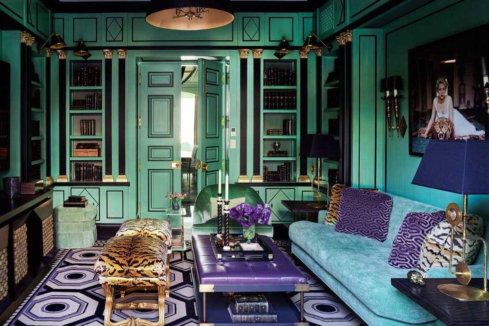
On the surface this is a color combination that sounds as if it would never work.. Until you see the below example.
In this example bright nettle greens combine with regal purple to create an office environment that is striking, bold and classy.
With hints of Arabian styles, this environment looks crisp and refreshing thanks to the natural connotations of the green. More so, in some countries Island Green is also seen as a sign of wealth, so this is one office environment that would promote feelings of focus over those of procrastination.
It also creates the perfect backdrop to be paired with natural homeware accessories like lacquerware and antique furniture.
2. Hunter Greens and Refreshing Raspberries
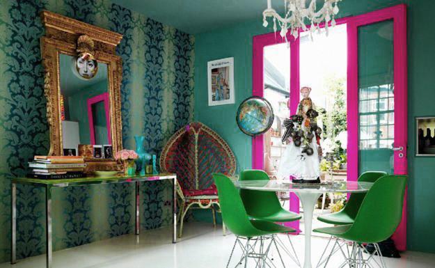
Hunter Green is a deep color most commonly associated with the copious mottled greens of forests. Meanwhile raspberry pink provides a contrast that adds a little refreshment to create a bold color palette bursting with wholesome natural flavors.
In this color scheme green promotes feelings of clean living and health, and the raspberry provides that much needed accompaniment of childlike playfulness.
An entrancing mix, this could be used for a dining room that’s bursting to display some originality, or even as a study or office environment. Together the colors play on natural energies and tend to work more to rejuvenate than to relax, so stay away from living areas or bedrooms with these.
3. Black and Orange
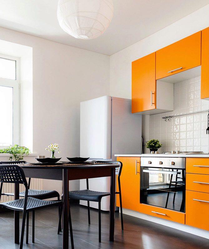
We’ve all seen the classy combination that is black and gold, but what about when you pair charcoal or onyx blacks with a splash of bursting and refreshing orange?
You get incredible combinations like the one above. The seriousness of strong blacks combine well with the mischievous shades of orange. Dark and light colors have always been proven to work well if they can find their accompanying match, and black and orange is a surprisingly overlooked combination that’s capable of drawing compliments from visitors.
A bold color combination, it flaunts contemporary style with feelings of sincerity, creativity and practicality. This color combination is therefore best used in rooms like kitchens, studies and studios.
4. Aspen Gold and Ocean Blue
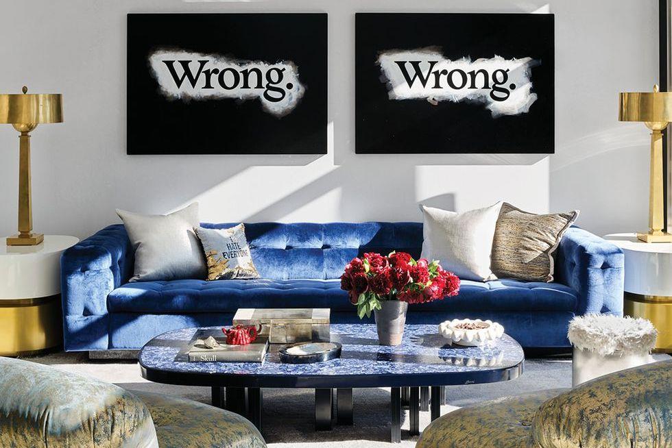
These two colors bring their own sense of class to whichever room they touch, but when combined together they are a brave and attention grabbing choice.
Aspen Gold is capable of exuding elegance whilst also being capable of significantly brightening a room. Meanwhile the calm serenity of ocean blue promotes soothing feelings of grace, regality and serenity.
Blue and gold are two colors that aren’t used together enough. When paired in the right hues they are bold, but provide all the right color combinations to truly inspire. Gold brings feelings of optimism, wealth and warmth encouraging us to feel relaxed and happy within our environment. Blue calms the brightness of the gold, adding tranquility and further easing us into a sense of peace.
5. Dusky Yellow and Stone Grey
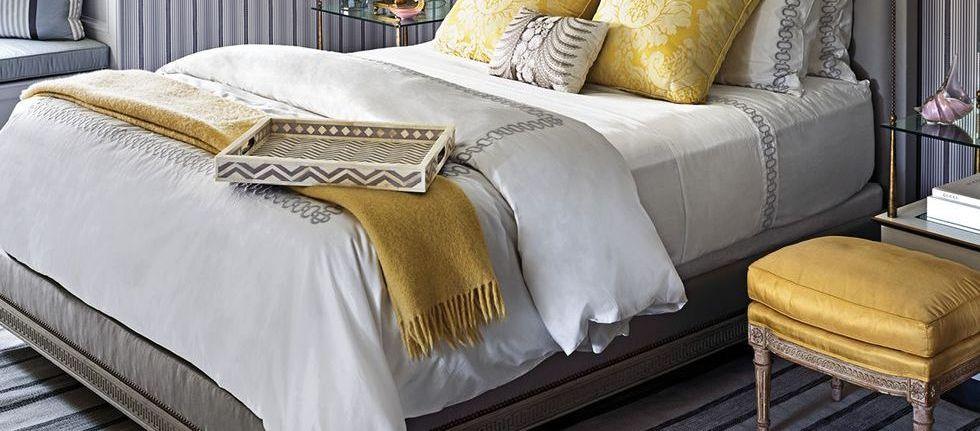
Yellow and grey are a bolder, more unique take on the traditional styles of gold and silver.
In this combination the yellow serves as a paler tone, exuding happiness, optimism and at the same time, a touch of sophistication.
Due to its brightness and connotations with the natural light and sunshine, in this bold color scheme yellow can also serve as a refreshing partner to the coolness of the grey, making for a truly Mediterranian style mix.
The grey in this combination promotes feelings of timeless elegance, making whichever room it is placed into appear clean and classy. For this combination we’d recommend bedrooms or living rooms, as both colors serve to relax and unwind.
6. Blue and Red
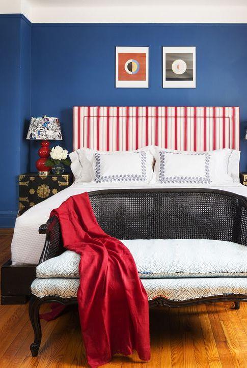
Blues and reds have gone together since the beginning of time and they are still an eye catching, deep, fire meets water type of elemental connection.
They’re a bold and effective mix because of their connotations: Blue promotes feelings of calm, trustworthiness, and security whereas red speaks of passion, love, and danger creating an intoxicating mix.
Used in flags around the world, as well as popular franchise like Pepsi, Dominos Pizza, and the NFL, the combination is bold for a reason: It grabs attention and captivates strong feelings in viewers.
When including it in your home use this combination in playrooms, bedrooms and even living rooms. Whilst bright, the colors are not overly stimulating and possess a natural earthy connection due to their links with the elements.

